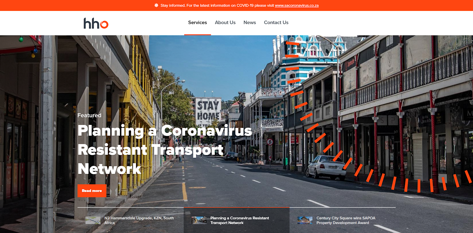
The design addressed multiple problems with the previous site while reflecting the company's rebrand. The IA was vastly improved, with services being categorised more logically which made them easier to find. The relevant people for each department were made more visible and easier to contact.
2019
View liveHHO Website
An overhauled website for HHO, an engineering company in South Africa
- HHO
- Design
